
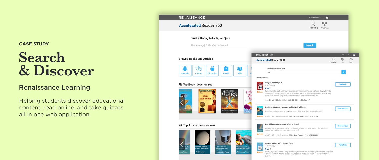
Our educational suite for classrooms help teachers access students’ math and reading levels through standardized tests, and in-class weekly assignments. One apparent need was to fix the disjointed reading experience for students — discovering online books, online articles, and taking quizzes on what they read were all separate flows from the student homepage. I was tasked with creating a more unified experience where students can browse both books and articles, and take quizzes in a more streamlined experience for students. My first step happens before my Scrum team actually works on the epic: I meet with the Product Owner and discuss the business requirements, and take notes of his thoughts and suggestions for potential directions I could take. I give my feedback and high level white boarding discussions, and then I hit the drawing board. One must have was to direct students to the growing library of non-fiction articles. Many schools have requested more non-fiction content for students to read, as there was already a wealth of fiction books to read.

01 / Plan

After reviewing the requirements with the PO, I work closely with the UX Architect to map out the current flows, use cases, and determine other impacts it may have for the user who typically goes from one app to another in the suite during their classroom lab time. We also have opportunities to visit classrooms to observe how students use our product, as well as even help students go through a lesson in our suite. I observe that every minute of education is so important, and having a student get frustrated or confused because of complicated or confusing user experience of the app is a loss on many levels.

02 / Research
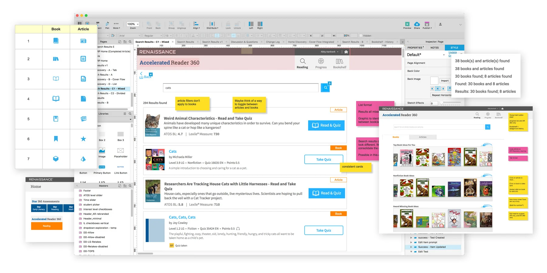
I start off creating low fidelity wireframes — one that meets the PO’s suggestions, and a few other exploratory concepts. The WF then goes through UX team reviews, PO review, and Scrum team during the Epic review/planning meetings. Noticing we did not have an established pattern of displaying different types of reading content together, I tried different concepts of displaying book and articles together. The WF soon evolved in to a high fidelity clickable prototype in Axure. The UX Architect remotely conducted usability testing with the prototype, while I assisted by taking notes and asking questions during the sessions.

03 / Draft


Through the usability testing, we learned that our proposed flow to combine books and articles was good, but we needed to call out particular elements better, such as, reducing visual clutter by limiting colored labels and aligning elements. Addressing these issues, along with refining and polishing, we were now ready to send high fidelity prototypes to the developers to code. I worked alongside the developers and conducted UX testing throughout the Sprints to ensure the prototypes were coded as designed.
04 / Final


